TOP 10 WORLD CUP LOGOS OF ALL TIME
The World Cup also brings with it, a new logo and here we take a look at some of the best designs the tournament has given us:
1. South Africa 2010
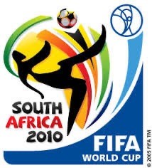
We love the 2010 WORLD CUP logo which uses all the colours of the rainbow, matched with a stylish overhead kick of the ball, this design provides fun and excitement - exactly what the World Cup is all about.
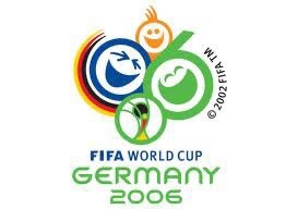
2. Germany 2006
A logo can always win you over with smiling, laughing faces. The GERMANY 2006 logo shows an engaging, heart-warming look at the biggest sport event in the world. The faces succeed in capturing the mood of the cup while also being a good representation of how Italy felt when crowned the winners!
3. England 66
The time when England did have the world in motion, and football did indeed COME HOME. This logo emphasises everything about England’s FIRST and so far only World Cup win. The Union Flag, the trophy, England’s Three Lions were all the ingredients needed to produce a logo which not only represents the host and winner, but also the tournament itself.

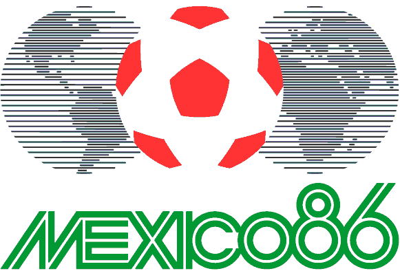
4. Mexico 86
It isn’t the most colourful of designs, but Mexico did a good job with their logo - the ball placed comfortably between two planet Earths, suggests everyone should become involved and engage with the beautiful game and their country. Argentina took home their SECOND World Cup title.
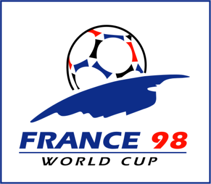
5. France 98
This logo worked well in host France’s favour (winning their first WORLD CUP tournament ) and the image seems to reflect their triumph perfectly. The ball literally sitting on top of the globe demonstrates that main idea about the cup- there can only be one winner!
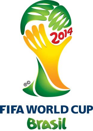
6. Brazil 2014
Simple, but effective is arguably the best way to describe the current World Cup logo. The image of hands reaching out to form a ball and also a globe works really well- it almost looks like a facepalm. So far, this year’s TOURNAMENT has been fairly unpredictable; it’s difficult to say which team represents the hand reaching that ball- only time will tell!
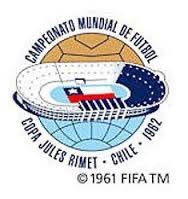
7. Chile 62
The 1962 TOURNAMENT was all about South America, with Brazil crowned the winners for the second time and host Chile presented us with a rather noteworthy logo. The stadium image placed within the globe is telling the world to look at it, look and embrace everything that will happen at this stadium, at this tournament- an effective way of engaging the rest of the world.
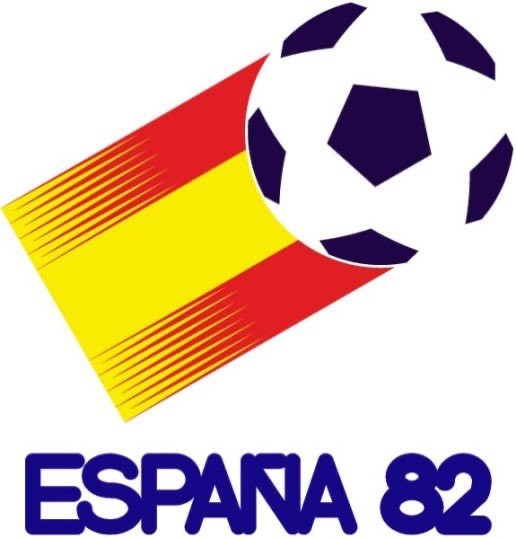
8. Espana 82
The Espana 82 logo provides an interesting perspective of the TOURNAMENT. The image of the ball placed at the edge of the Spanish flag looks like the ball is to be wrapped up by the flag, a good representation of Spain chasing the title. Sadly for Spain, Italy swiped it away from the hosts but the image succeeds in what Spain are capable of, leading to their win in South Africa 2010.
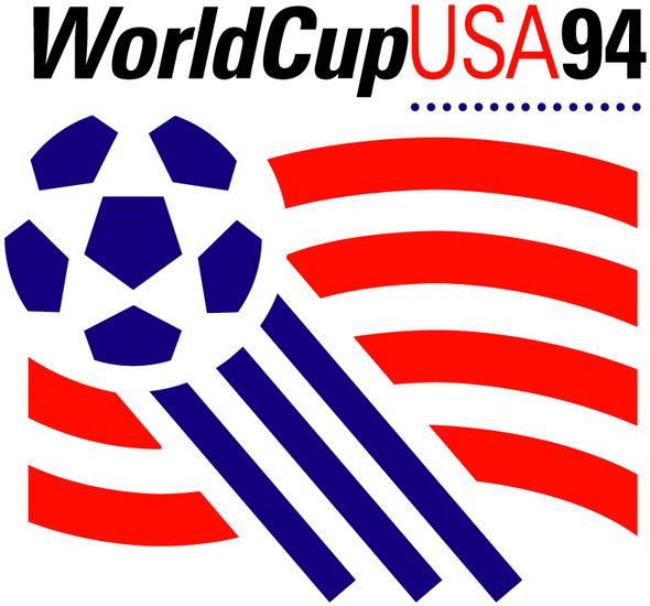
9. USA 94
While Brazil was busy earning its FOURTH TITLE, hosts USA of course decided to use their flag colours for their logo. The power of red, white and blue is clear; the American flag has always stood out to the world so incorporating it in a style for football is the most appropriate form of logo. The only missing element is the 50 stars.
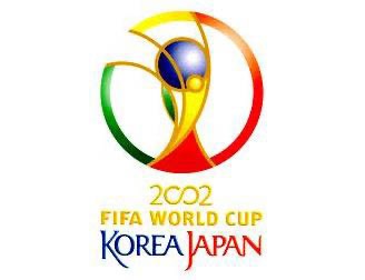
10. Korea Japan 2002
Using a trophy design provides a fresh looking logo. While Brazil stood out WINNING the cup for the fifth time, the 2002 logo also stood out as the image of the trophy is clear and concise- if you want it, come and get it!
If you need a logo designing then we have our own in-house design services team that will work closely with you to create that impactful graphic design that you require. To find out more information on our creative design services, then contact us on 0191 2325454 or email us at print@photoline.co.uk