The role of colour in design
Whether you are designing a logo, advertisement or even a flyer, you must understand that the colours you select are just as necessary as the information that you are attempting to convey.
The role of colour in design plays a crucial part in evoking a certain message and many colours denote a meaning to many people. Therefore it is useful to understand how using different colours will have varying effects on the end user or consumer.
When we look at branding, you will notice that colour plays a huge role in reflecting the product or service, and brand as a whole. This is why it is integral to your brand to understand how visuals can have a significant impact on the way your company or the services and products that you offer are recognised and perceived by your target audience.
When approaching your brand design, it is crucial to do your research and take a look at other brands within your target market and take tips from them. What colours or designs are they using? Play around with ideas and colour schemes and focus on companies that have strong brand awareness and recognition in the marketplace and form your design around these elements.
You may be tempted to just use your favourite colours without considering what it may be saying about you and your brand. But remember, different colours can mean different things, especially in advertising. For example, the colour red can be associated with danger and violence, however a darker shade of red gives the impression of richness and elegance.
Colour is said to be one of the most influential aspects on people, closely followed by shapes, symbols and then last but not least, words. So, focussing on the human’s natural senses in your colour choices/ designs may well give you that point of difference and create positive competition.
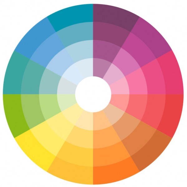
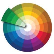
If we take a look at the basic colour theory behind a colour wheel, we can attempt to understand how colours can complement each other and how using two colours that don’t pair up can have a detrimental effect.
Designers tend to use four main colour schemes within design; monochromatic, analogous, complementary and triadic.
The ‘monochromatic’ or monochrome colour scheme actually uses single variations and shades of one colour, such as pink, red and dark red; this can evoke an elegant and balanced design overall.
The ‘analogous’ scheme uses colours that are related and incorporates shades that are next to each other on the colour wheel. These can be colours such as red and violet.
The ‘complementary’ scheme takes colours that are opposite one another on the colour wheel as they directly contrast each other and can create a dramatic effect. These can be colours such as orange and blue.
Finally, the ‘triadic’ colour scheme is clever in the way that it incorporates three separate colours from the colour wheel that are equally spaced around the wheel. This could be blue, yellow and red, for example.
Colours tend to be interpreted in different ways, so let’s take a look at what messages certain colours send to the end user below:
GREEN – This tends to have the meaning of wealth or money, but could also be a calming and tranquil colour. It could also evoke messages of ambition, or protection. Green is very strongly associated with all things natural.

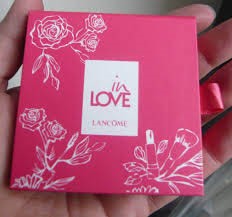
PINK – This colour usually evokes a message of femininity and romance. Pink is also intuitive and insightful, showing tenderness and kindness with its empathy and sensitivity.
BLACK – Black can be quite a powerful colour and can be very mysterious at the same time. Many brands that want to be seen as elegant will use this colour for sophistication and also functionality.

BLUE - Blue is a very calming colour. It can be strong and steadfast or light and friendly. Blue is the colour of the intellect, the mind, making it the colour of communication, which is probably why Twitter, Facebook and LinkedIn all use it for the colour of their band. Social media, is all about communication after all.
Blue also has the perception as being trustworthy, dependable, safe and reliable. These are the perceived positive qualities of a business that chooses blue. Research has also shown blue to be the world’s most popular colour.

So if you aren’t designing the logo or graphic piece yourself, make sure that you select a designer that understands the importance of choosing the correct colours within a design brief to benefit your brand.
If you have a design project you need help with call us on 0191 232 5454 or see our website to see how we can help you create impactful, effective marketing materials.