THE PSYCHOLOGY OF COLOUR & HOW YOU CAN HARNESS IT
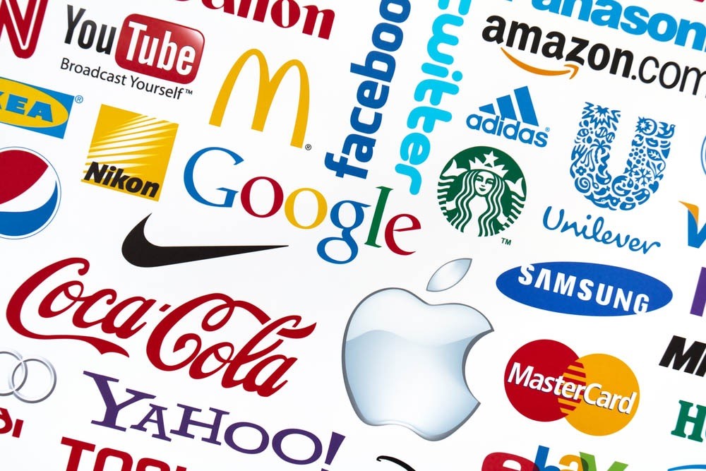
It’s often overlooked, but colour can often be the primary reason an individual chooses either a product or a service. In retail for example a staggering 93% of buyers focus on visual appearance, whilst 85% claim that colour is the primary reason for a purchase. So next time you drive past a McDonalds, see that red & yellow sign and to the drive through on autopilot, it’s not your fault.
So How Do Different Colours Influence People?
Red
The colour red creates a sense of urgency, stimulating the body and heart rate, which is why it is widely deployed to add drama and effect to any clearance sale. Red also helps to create an appetite.
Coca-Cola is one of the world’s most instantly recognisable brands, this is in no small part due to the deployment of red across its branding.
Blue
Possibly because of the baby outfits, blue is the colour which is strongly linked to men. This is surprising, when you also consider that it represents peace, tranquillity and reliability. Blue should be deployed by brands which are looking to promote trust in their products.
Barclays uses blue to reflect the values of reliability and trust as mentioned above.
Green
Green is associated with good health, power and nature. Green is widely used in stores to aid relaxation; health shops also widely use green to create an organic & natural feel.
Starbucks uses green to create the sense of health, nature and relaxation on entering a store.
Purple
Purple is has strong links to royalty, luxury and respect. Purple is also thought to increase creativity and problem solving ability. It is often seen promoting luxurious consumable products.
Cadbury uses purple to compliment and represent its line of luxury chocolates.
Orange & Yellow
Yellow & orange are colours which promote optimism. These colours, because of their application on heavy machinery and safety clothing, can represent caution.
Easyjet uses orange to create optimism about its affordability, with Easyjet you can afford to fly away more often.
Black
Black is associated with authority, power, and strength. Black also has strong links to intelligence, but only the smartest amongst know how to use it well, too much and the colour can quickly become overwhelming.
It made sense for Guinness to use the colour black for obvious reasons. Black also ties in well with the powerful advertising campaign Guinness deploys, most obviously its iconic surfer ad.
Grey
Grey isn’t the most inspiring of colours, when used sparingly though it can represent understated luxury.
Swarovski uses grey in its branding to complement its range of crystal jewellery.
White
White is pure and simple. White is often used to represent neutrality, which can really get people’s creative juices flowing.
The White Company uses white not only its branding, but in its business name. White reflects the pure, simple yet luxurious items it sells.
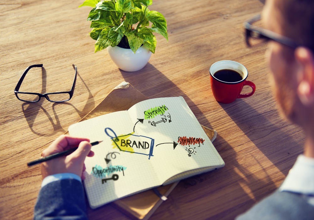
How To Choose Your Marketing Colours?
Having looked at the psychological value of colours, now it’s time to look at how you can apply these principles to your business.
Choosing your brand colours can be a difficult task, and whilst research points out how we perceive colours, interpretations of colours vary in every individual. The colours people like are influenced by their own preference, upbringing and context.
Context is something not to be underestimated, for example if you specialise in organic salads it’s probably not the best idea to use a bright orange for your branding. We have collated some expert tips to help you decide below:
- Appeal to your audience; look at their gender, age range and preferences.
- Use a 60-30-10 rule with three different colours.
- See what the competition is doing? Do you want to play it safe within your industry?
- Take note of cultural connotations of colours if your audience is international.
When You Have Made Your Decision…
Having decided on your colour scheme, it’s time to transform your colours into a reality for both your business and its audience. Your website is more than likely going to be the first place in which your colour change is rolled out, after that it’s important to remember that any marketing materials you do have...Will need converting. Brand consistency is key.
Here at Photoline we have the team to turn your offline branding ideas into a reality, from in house graphic designers and the capability to print and create almost any offline marketing options, with same day and super fast delivery, we are the only printing supplier you will need.
Our capabilities include a comprehensive range of large format printing and small format printing services from exhibition stands and banners , posters and foam board printing to perfect binding, and leaflet printing. To see the full range of our services click here.